- Web
- Logo
- Brand Identity
Tiny Living
Tiny Living is a fictional tiny home builder based in Vancouver, BC. In addition to their design and building services, they print a monthly magazine.
The objective was to create a magazine cover, a landing page mockup and a banner ad. These assets would showcase the company's products and unique brand identity.
Breakdown
-
Date
October 2022
-
Role
Graphic Designer
Web Designer
-
Software
Adobe InDesign
Figma
-
Deliverables
Magazine Cover
Banner Ad
Landing Page Design
Summary
-
01
Brainstorm
Brainstorm a concept for a magazine with the theme, "Small is Beautiful"
-
02
Ideate
Produce a creative brief that would detail the brainstorming process for the brand
-
03
Design
Design a logo, print magazine cover, landing page and banner ad using Adobe InDesign
Brainstorming the Brand Concept
With the prompt “Small is Beautiful”, I wanted to create a magazine that focuses on how to live “tiny”. Specifically, the tiny house movement and lifestyle. Overall, the main purpose would be to promote this movement by providing advice, tips and guides. It would also encourage people to reflect on their current lifestyle and environmental impact.
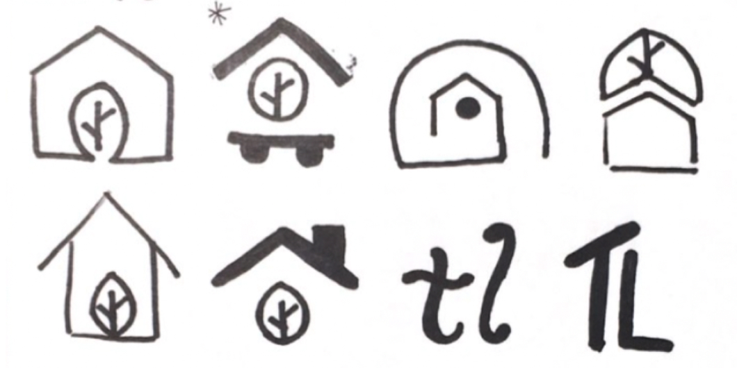
Logo Design
For the logo, I wanted to create a simple logo that represented a tiny house. To do this, I used lines to create a roof and base to imply the shape of a house. The base would include two wheels to represent how many tiny houses are built to be mobile. The window of the tiny house would include a leaf to represent how tiny living is eco-friendly.
Colour Palette and Design Concept
The look and feel of the magazine would be a mix of both traditional and modern elements. I did this to reflect how tiny houses are a relatively new concept but still serve as one's home. The designs themselves would have a modern look as I chose to only use sans serif fonts. To contrast, an Analogous colour scheme of orange, green and yellow is used to give a warm and welcoming feeling as these are naturalistic colours.
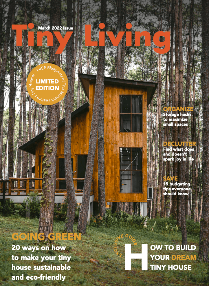
Magazine Cover Design
To gather ideas for the magazine cover, I looked to home interior design and architecture magazine covers for inspiration, such as Architectural Digest and Dezeen. In my thumbnails, I incorporated how they highlighted the magazine title and featured articles. I did this by making the text larger so there was a clear hierarchy. The final design was then created in Adobe Indesign.
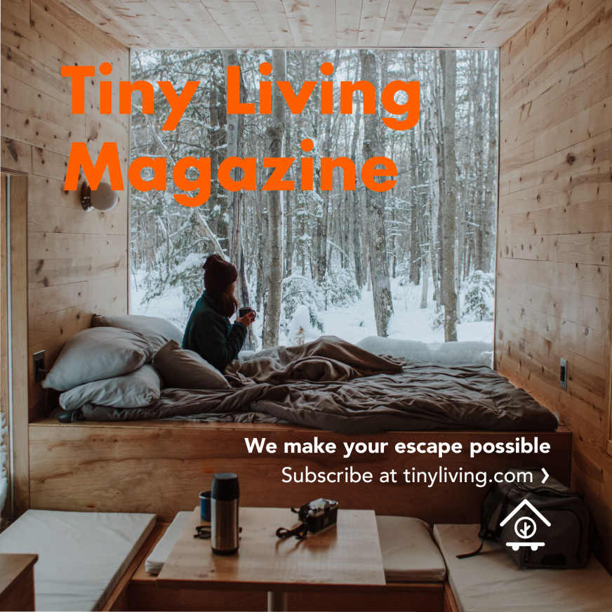
Banner Ad Design
For the banner design, I decided to go with a square banner as this type of ad would be commonly seen on the aside section of websites. I wanted to grab people’s attention by making the “Tiny Living Magazine” large and in a bright orange that contrasts with the photo used. There is also a clear CTA to go to the website if consumers are interested in subscribing.
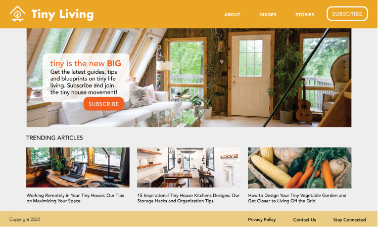
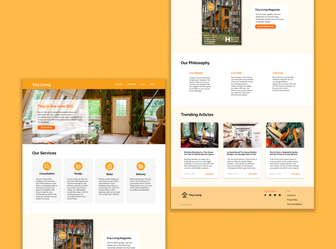
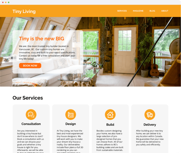
Landing Page Design
For this project, we were required to only promote the magazine on the landing page mockup. I decided to redesign the page and that it would promote the magazine along with advertising tiny home building services. I created this mockup in Figma as I wanted to use Figma’s component creation capabilities. For this design, I reserved using the same bright orange for the CTAs as this would help grab users’ attention.