- Front-end
- Responsive Design
Rapidish
Rapidish is a fictional meal kit delivery company.
The purpose of this project was to showcase a mobile-first and responsive web design approach. This was done by creating a landing page with multiple breakpoints and incorporating 3 jQuery plugins.
Breakdown
-
Date
October 2022
-
Role
Front-end Developer
-
Tech Stack
Languages
HTML, CSS, Javascript
Libraries
jQuery
-
Deliverables
Landing Page Code
High-fidelity Mockup
Summary
-
01
Brainstorm
Brainstorm the website and content
-
02
Plan
Plan the HTML skeleton and research potential jQuery plugins
-
03
Code
Code the landing page with a mobile-first approach
Brainstorm
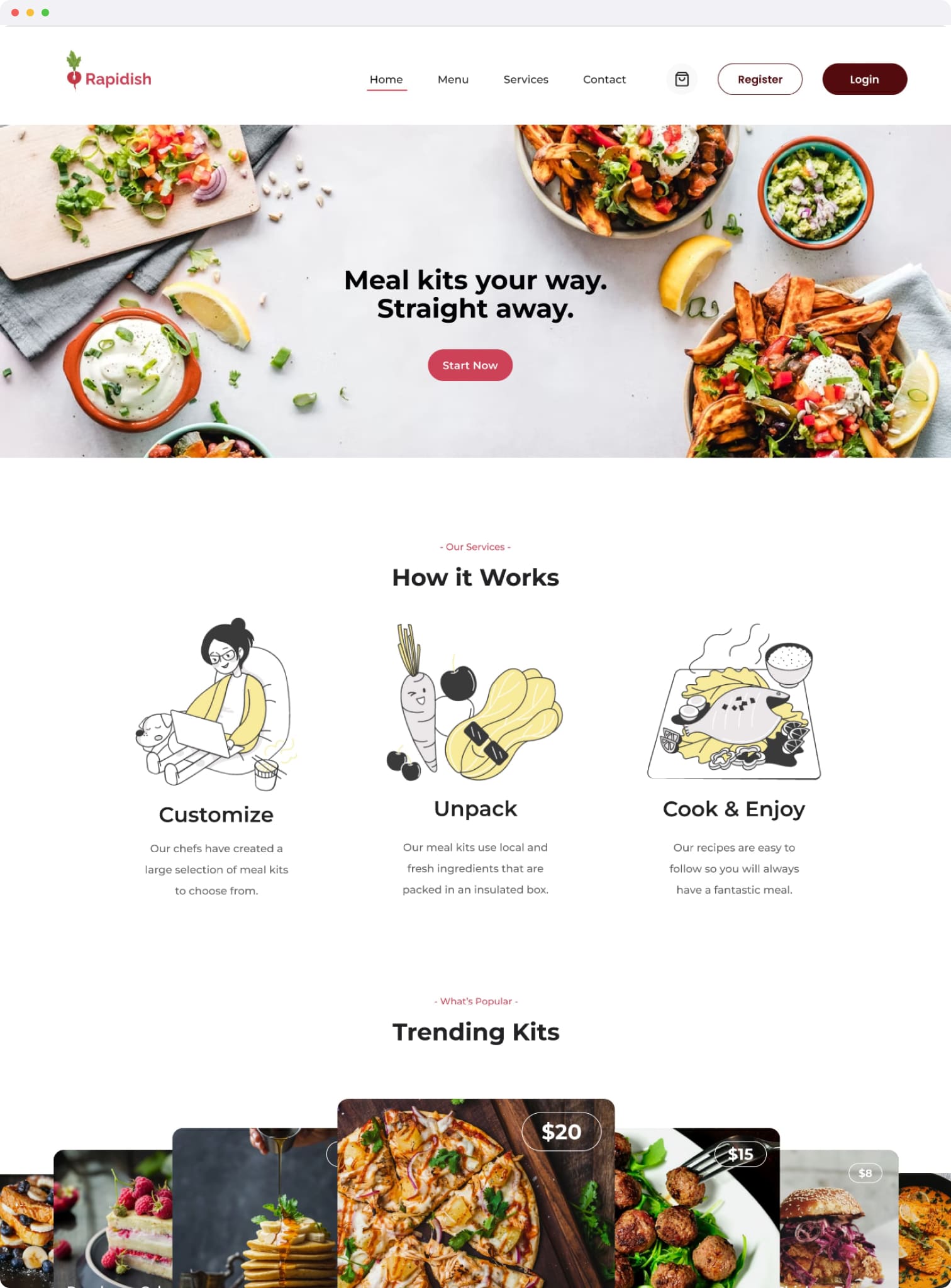
For this project, I wanted to code a landing page design where I previously created a high-fidelity mockup using Figma. This would be for a fictional company called Rapidish that offers a meal kit delivery service. I wanted to include more informative copy so I researched similar businesses, like Blue Apron and Hello Fresh, for inspiration. From my research, I found that it would be beneficial for potential customers to understand how the service operates and what is inside the meal kits.
Plan
After determining what sections the landing page would have, I decided which jQuery plugins to use. We were given the option of choosing 3 of the following: Gridder, Flickity, Lightbox, Accordion, MixItUp or Masonry. After looking at the documentation for each and seeing which plugin would be appropriate, these were my choices:
- Lightbox to display the Newsletter Subscription window
- Masonry to display a gallery of trending meal kits
- Flickity to display a carousel of what is inside the meal kits
Code
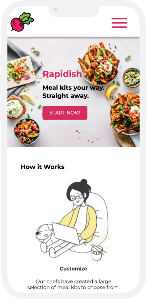
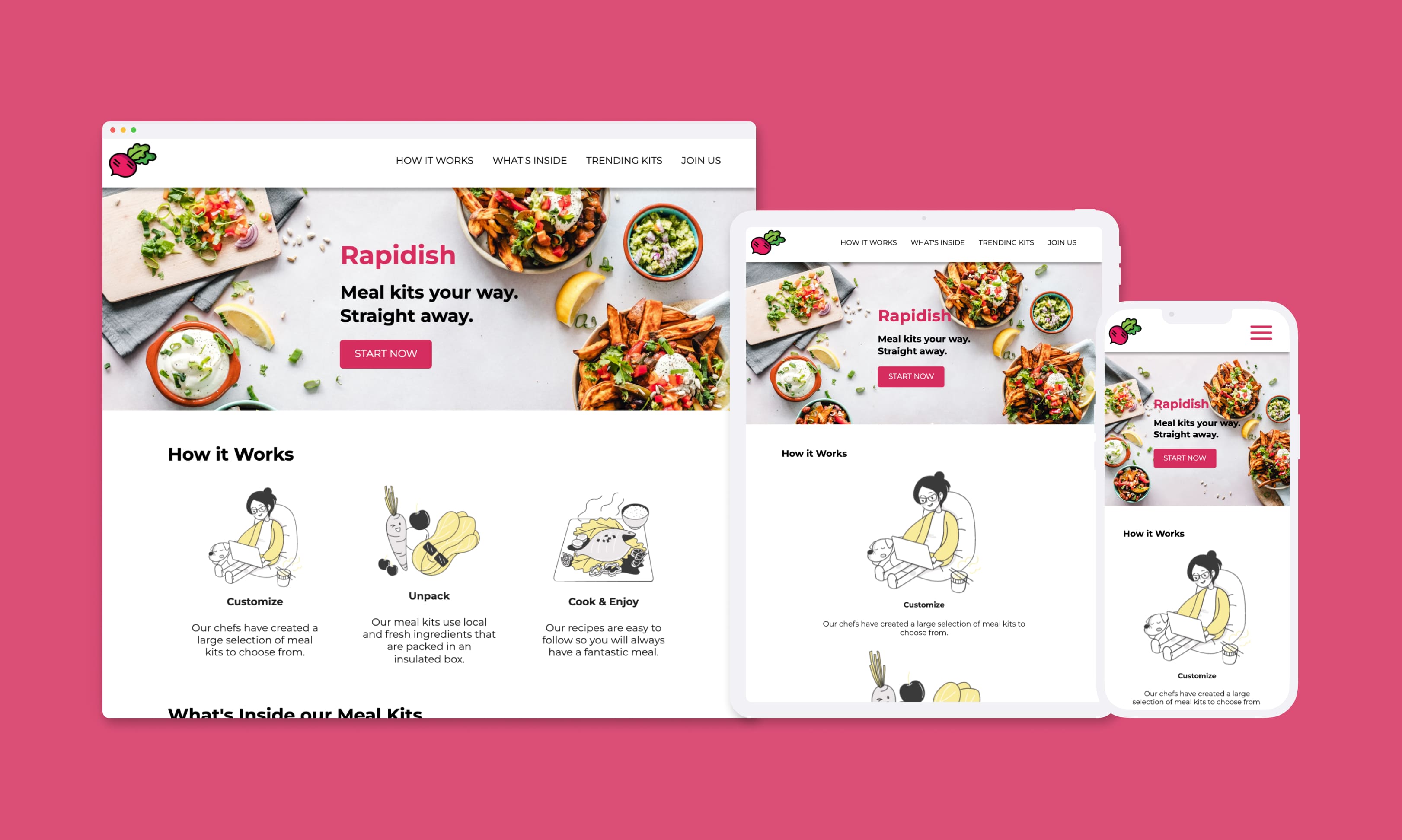
With my plan, I first coded my HTML skeleton and gave the needed class names for styling and to properly integrate the jQuery plugins. Afterwards, I started the styling process with a mobile-first approach. I started at a width of 320px and added breakpoints at the following widths: 576px, 768px, 992px, 1200px, 1440px.
This landing page also has some of the following responsive features:
- Below 768px, the navigation is a hamburger menu for mobile users
- The "What's Inside our Meal Kits" section would be a carousel on mobile devices only (below 992px)
- Hover effects for buttons kicks in at 1200px
Conclusion & Next Steps
Overall, the Rapidish landing page showcases their business and brand, for both mobile and desktop users. Next steps for this project would be converting the site code into a React App. This way, I can convert the header, footer and other sections into reusable React components. In addition, this sets up an easy conversion into a single page application for further iteration.