- Packaging
- Logo
- Brand Identity
Emerald Matcha
Emerald Matcha is a fictional matcha company that produces high-end matcha products.
The goal of this project was to present a consistent brand identity through the creation of a logo, product packaging and a stationery set.

Breakdown
-
Date
May 2022
-
Role
Graphic Designer
-
Software
Adobe Photoshop
Adobe InDesign
Adobe After Effects
Adobe Dimension
-
Deliverables
Moodboard
Thumbnails
Roughs
Ad Poster with 3D Render
Stationery Mockup
Summary
-
01
Client Brief
Exchange a brand and product idea with a fellow student
-
02
Brainstorm
Brainstorm & create the company logo and colour palette
-
03
Design
Create product packaging, 3D render, poster and stationery set
Client Brief
To simulate a real-life client scenario, we randomly received a fellow student's idea for a company. They would serve as our on-going client where we could receive feedback and suggestions. I received the following guidelines:
- Company Name: Emerald Matcha
- Product: Matcha Powder
- Main Colour: #00A651
- Customer Demographic: 25-45 year olds
- Competitors: Jade Leaf Matcha, Grace & Green Matcha

Logo Design
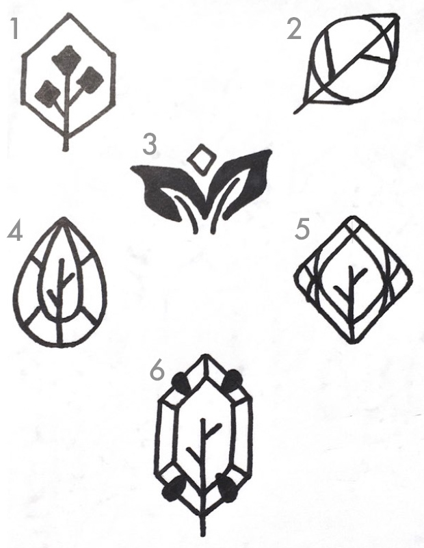
For the logo design, I wanted to draw inspiration from the company name by incorporating a matcha leaf and the shape of a gemstone. I also wanted to create a simple and clean logo to appeal to the younger customer demographic. After consulting with my client, I decided the final logo would be a matcha leaf in-laid in a tear-drop shaped gem.
Colour Palette
To go with the deep green colour given by the client, I decided to go with a Split Complementary colour scheme of green, pink and yellow. This colour scheme gives a retro trendy vibe, which encapsulates the idea of targeting a younger audience with a traditional matcha product. Pink and yellow would serve as visually-striking colours in comparison with the primary green colour.
Product Dimensions and Design
In order to determine the dimensions of the product, I researched how different high-end matcha brands packaged their product. One recurring format was packaging their matcha powder in tins of 3. After getting input from my client, I decided to go with a box with the following measurements: 10 inches by 4 inches by 4 inches.
With the dimensions determined, I created the desings in Adobe Photoshop. I used the deep green, yellow and pink colours to make certain elements pop out in comparison with the rest of the box. For instance, these colours were used to highlight the 3 different blends of matcha in the box.

3D Render
The assets were then brought into Adobe After Effects to create a realistic 3D render of the product. Two light sources were added to create depth and realism to the render. The image was then brought into Adobe Photoshop to add a complementary tagline.

Stationery Brainstorming
For the stationery set, a business card, letterhead and envelope would be created. I wanted to take elements from the packaging and incorporate some elements in the stationery. To generate ideas, a moodboard and 6 thumbnails were made for each stationery item. The thumbnail that most closely matched the theme of the packaging was chosen to create more detailed roughs.

Final Stationery Design
After selecting a design from the roughs generated, the final designs were created using Adobe InDesign. Elements from the product packaging design, such as the repeating pattern of the logo, were used to maintain a consistent theme. The designs were then taken into Adobe Dimension to create a 3D mockup. As a result, this created a strong brand identity for Emerlad Matcha.

